Cognub USA
An Innovation Incubator Company
My Role
UX/UI Design
Tools Used
Miro | Figma | Zeplin
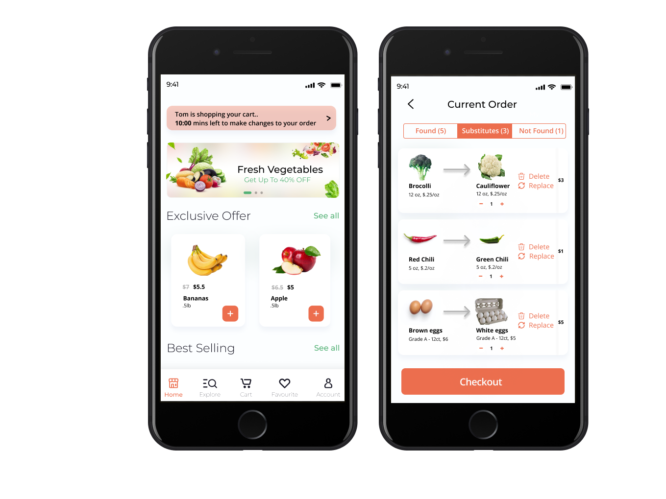
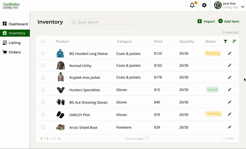
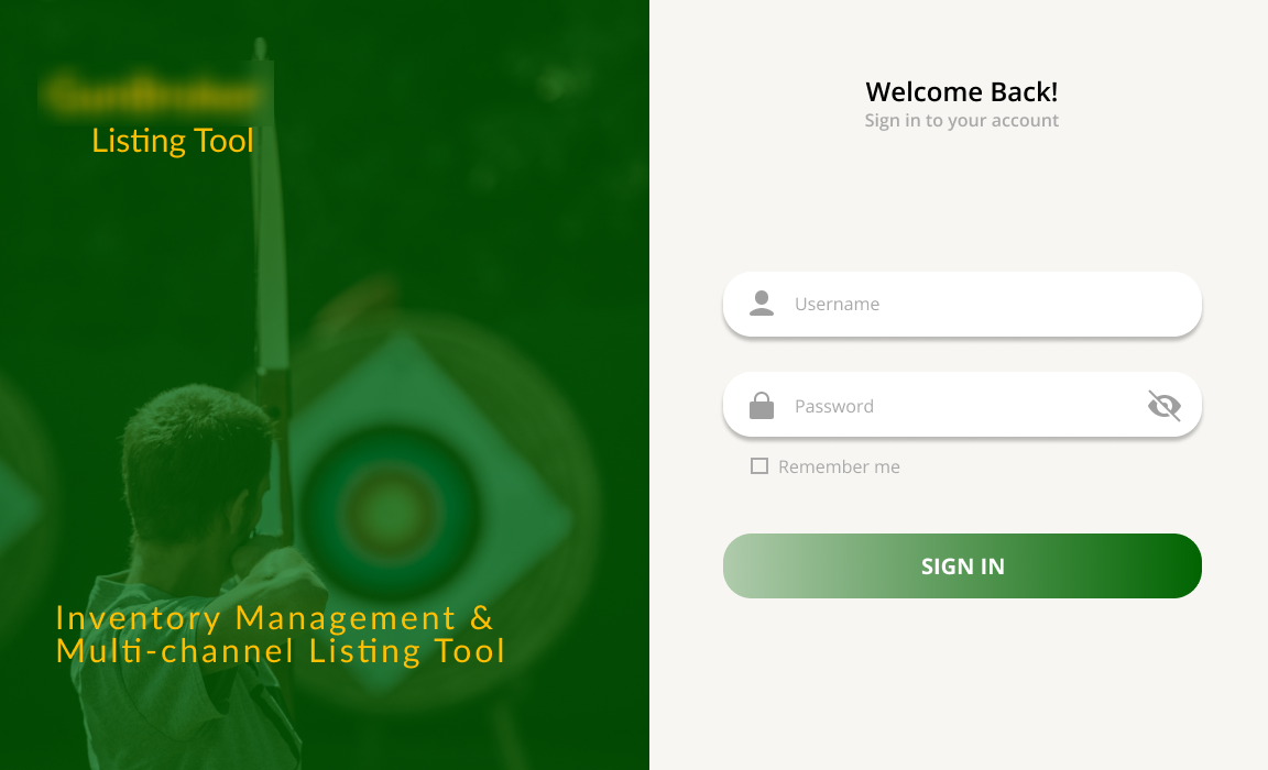
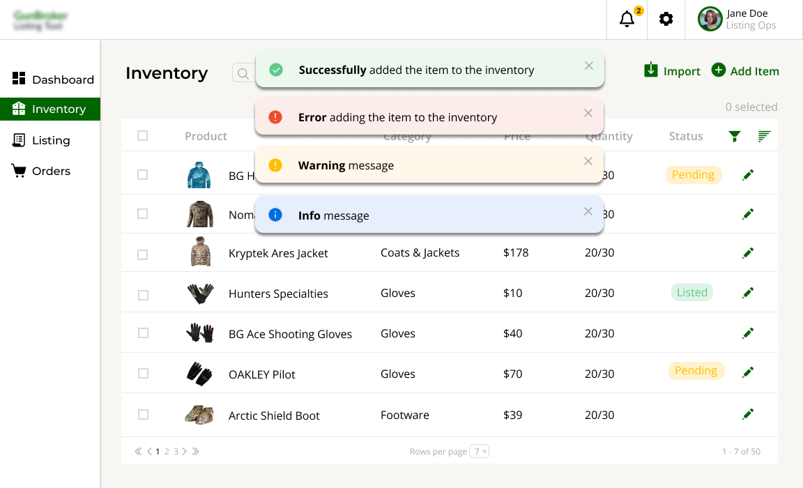
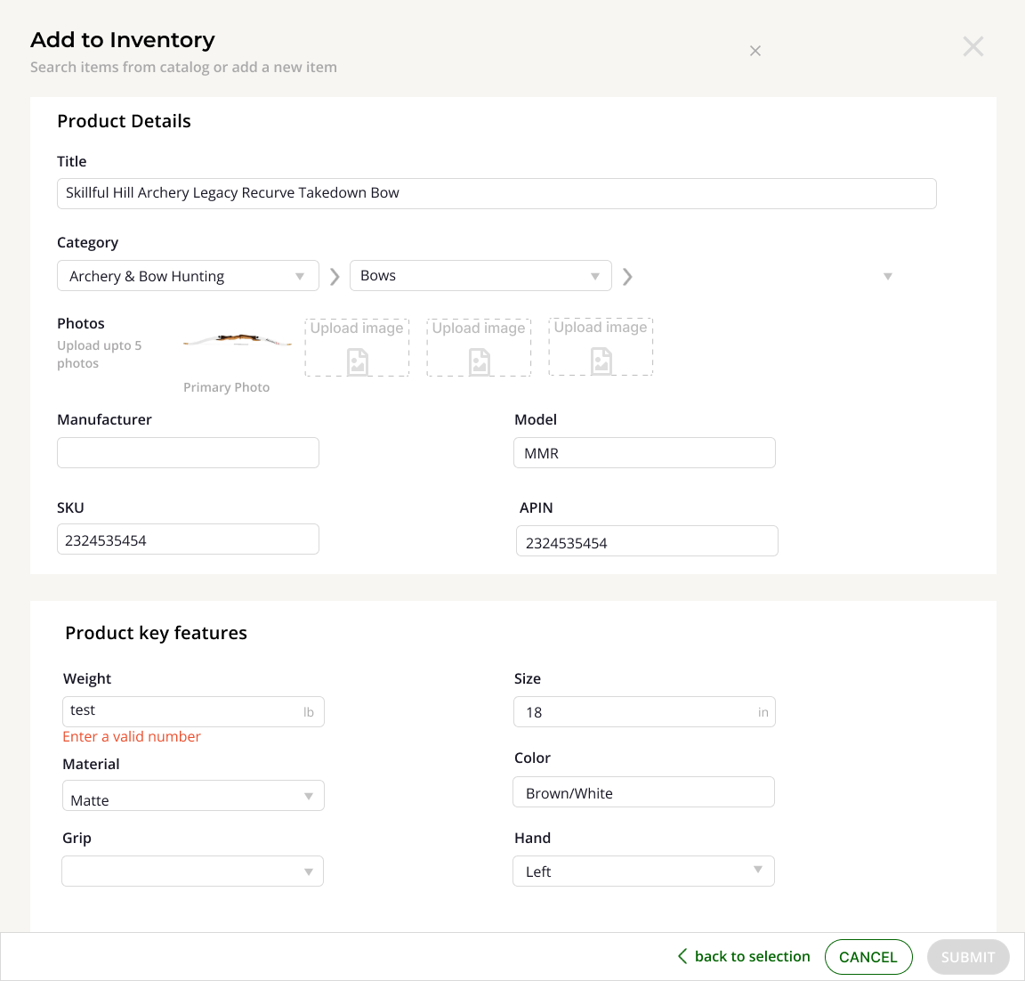
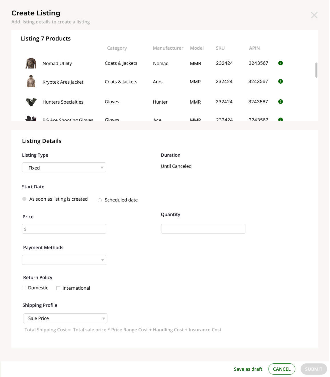
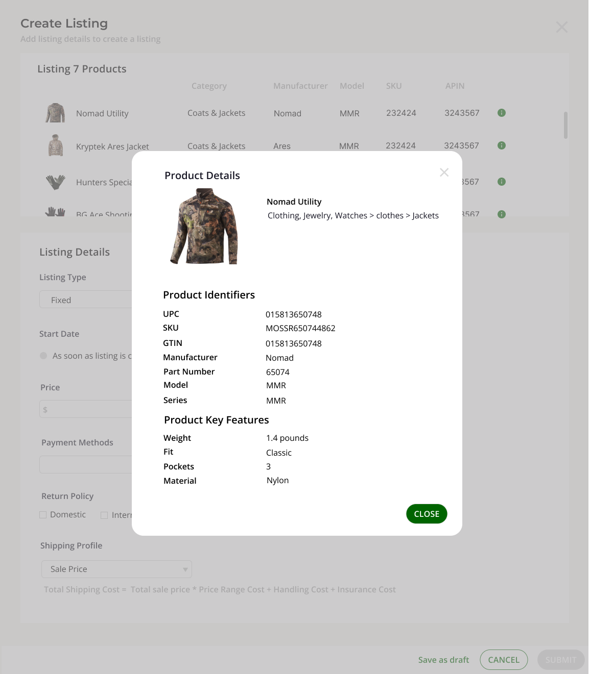
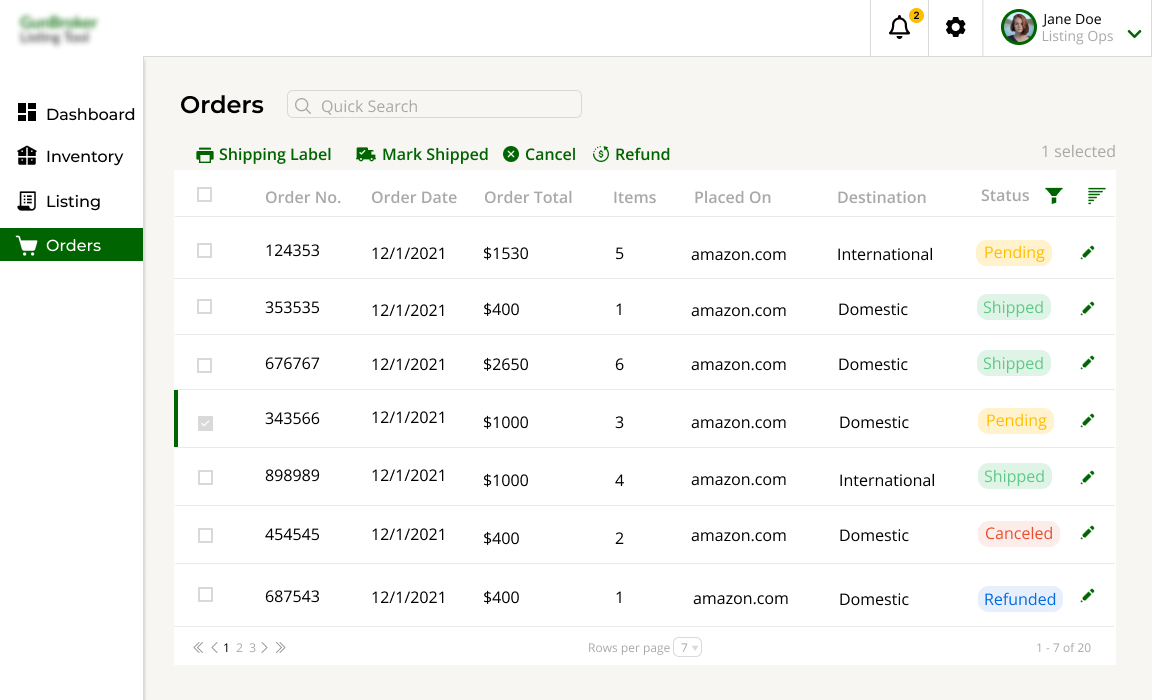
Inventory Management System
Worked directly with Cognub USA's B2B outdoor sporting client to design their new Inventory Management System that handles inventory, product listing and order management.
The Challenge
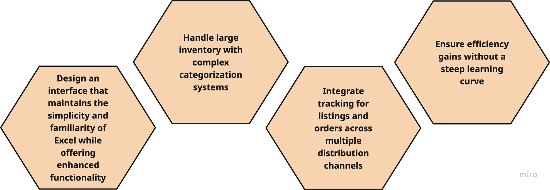
The primary challenge is transitioning users from their familiar Excel-based workflow to a more robust digital solution without disrupting their productivity or requiring extensive retraining.
Problem Statement
"Design a user-friendly inventory and order management system that feels familiar to Excel users while efficiently handling large product catalogs with complex categorization, enabling seamless product searching, inventory updates, and cross-platform order tracking—all without requiring significant retraining or disrupting established workflows."
This effectively captures the tension between preserving the familiar user experience of Excel and addressing the operational inefficiencies that emerged as the business grew. The solution must bridge this gap by providing enhanced functionality within an interface that doesn't intimidate users who are resistant to change.
"How might we create an intuitive inventory system that simplifies managing bulk inventory and orders while requiring minimal learning for current users?"
Research Goal
To understand how users currently manage inventory and product listings using Excel, identify their pain points, workflows, and mental models, and gather insights on what features and UI patterns they find most intuitive and essential for transitioning to a digital platform.
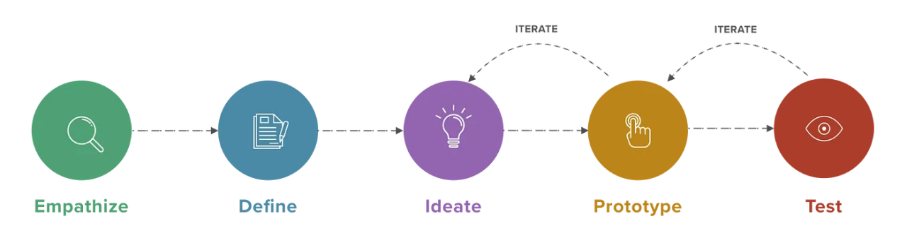
Process
Conducted semi-structured video call interviews to gather qualitative data. Further conducted video calls to validate the findings.
All interviews have been conducted remotely by using Google Meet
Affinity mapping
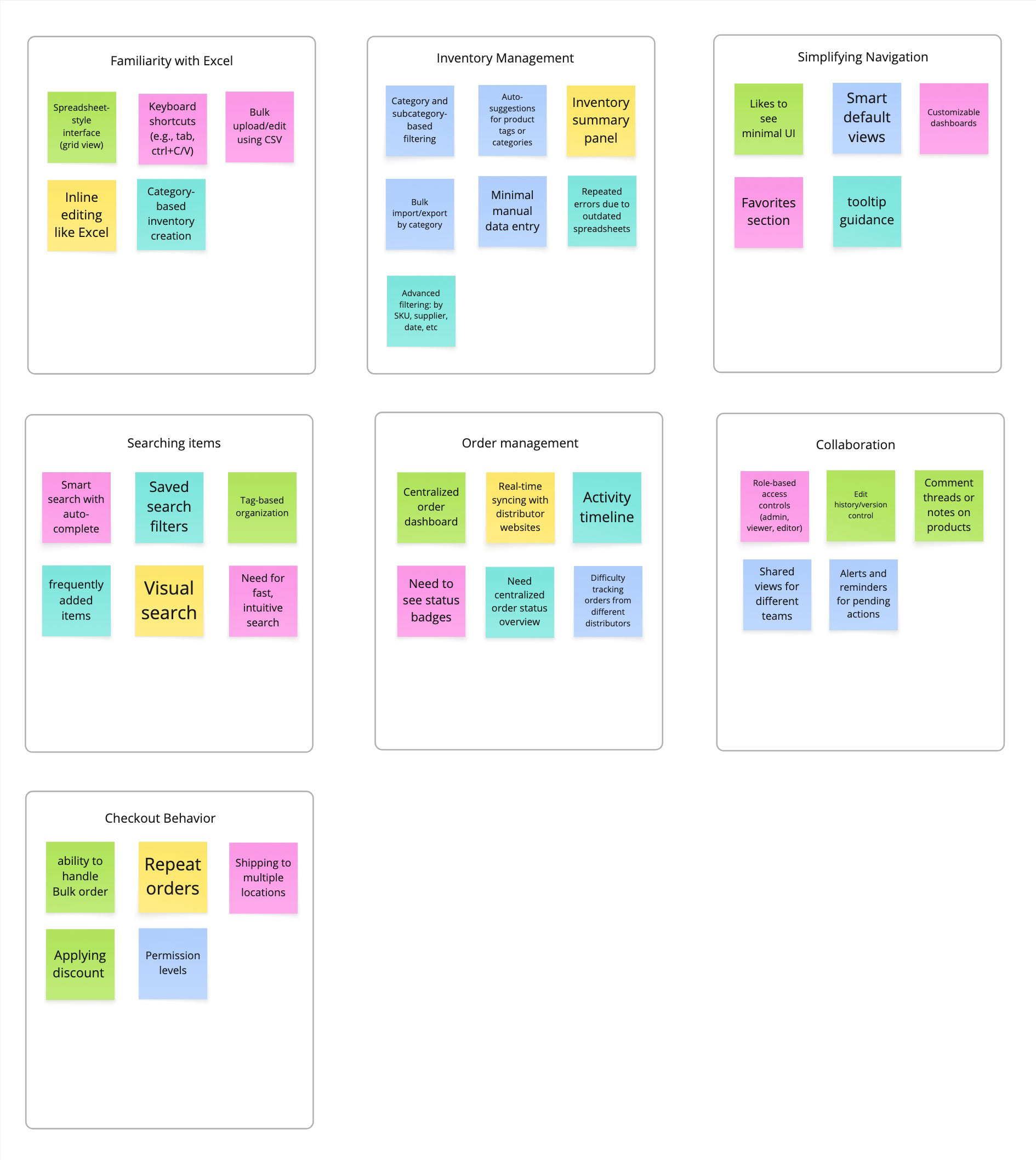
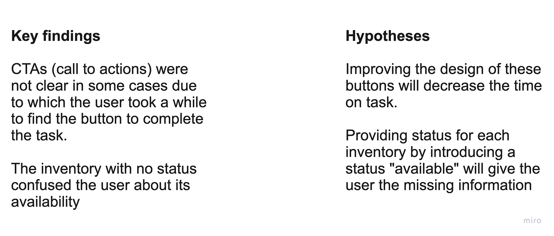
Key Findings
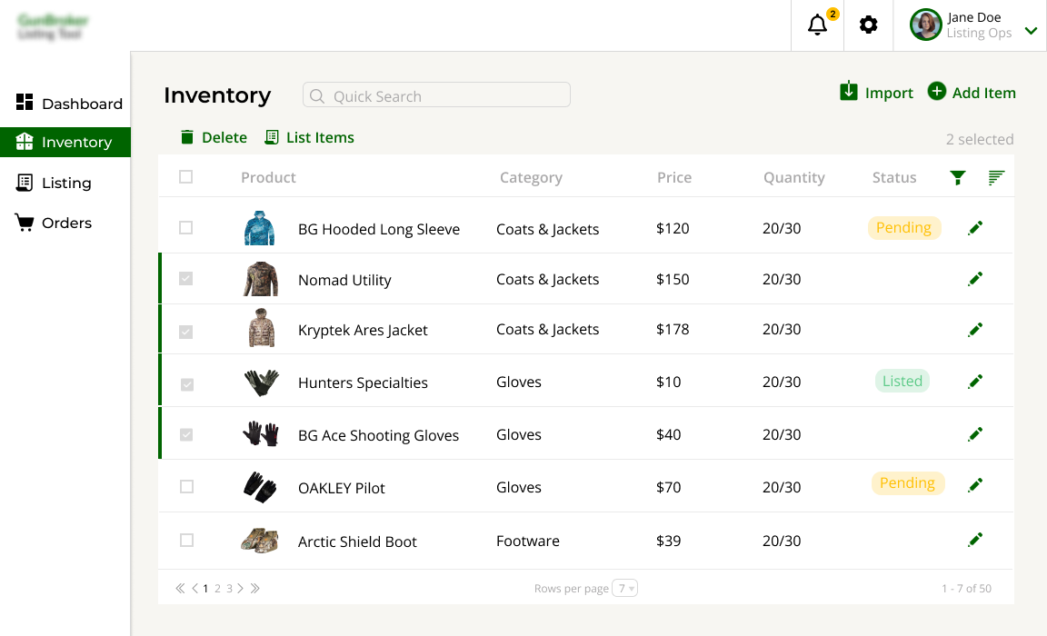
1. Users prefer bulk editing and copy-pasting over clicking through forms or dropdowns
2. Preference for clean, spreadsheet-like interfaces that feel familiar
3. Dislike systems with steep learning curves or unfamiliar terminology
4. Errors are common when copying data across multiple sheets
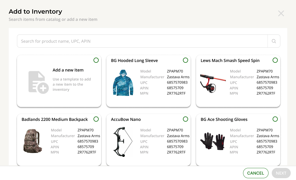
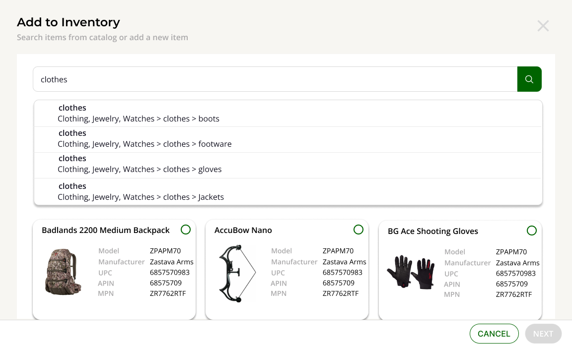
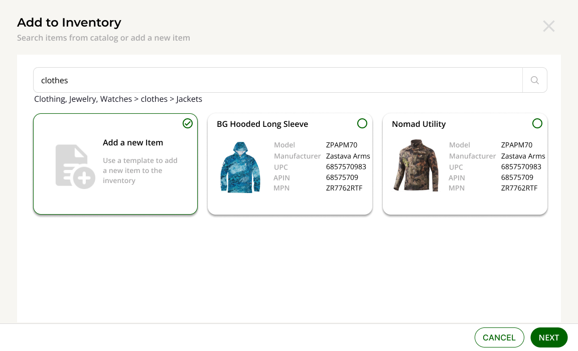
5. Strong need for smart search and filtering by category, subcategory, SKU, or distributor
6. Manual logging of orders leads to inconsistencies
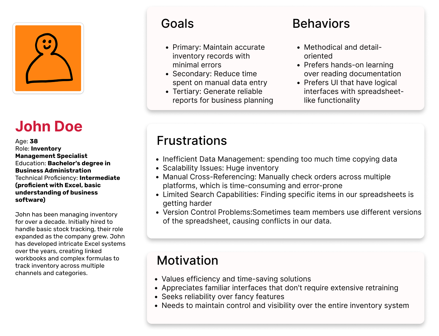
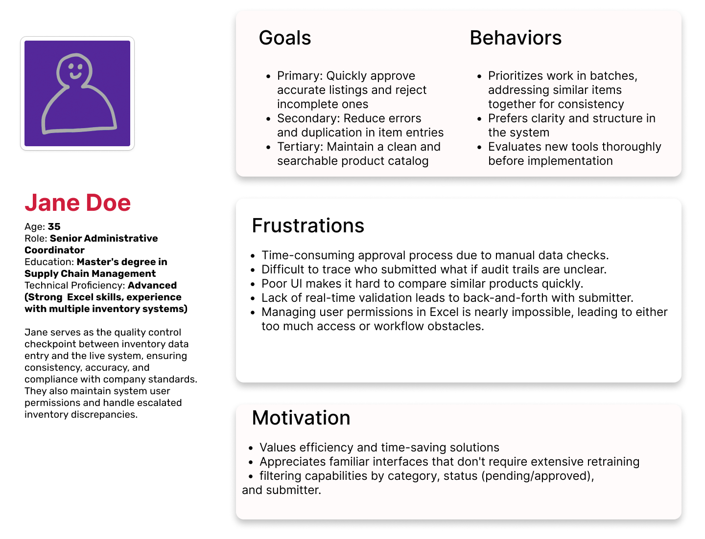
Personas
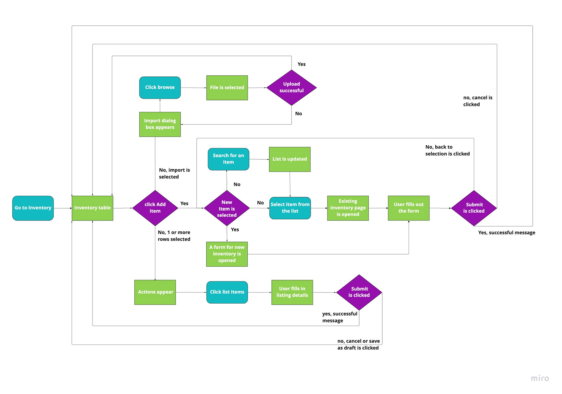
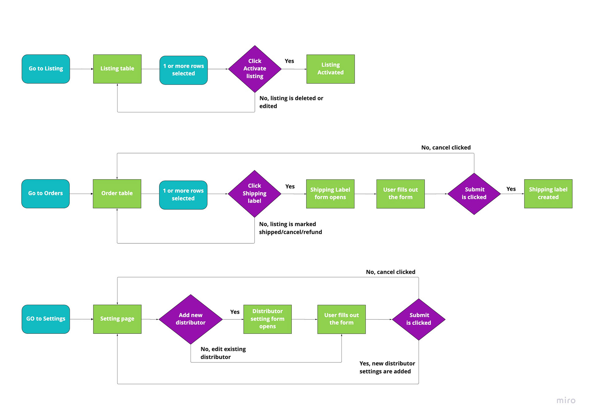
User Flows
Before diving into the designs I mapped out a few main user flows. This was done to identify which screens or features are necessary and where to place them for intuitive navigation. By mapping the journey I was able to spot bottlenecks and redundant steps.
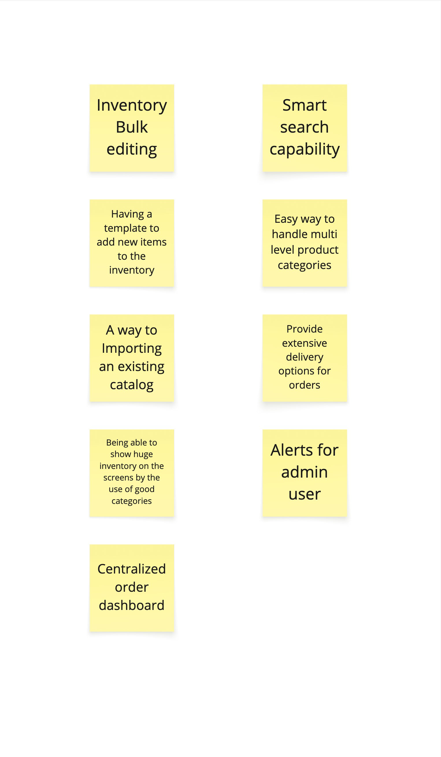
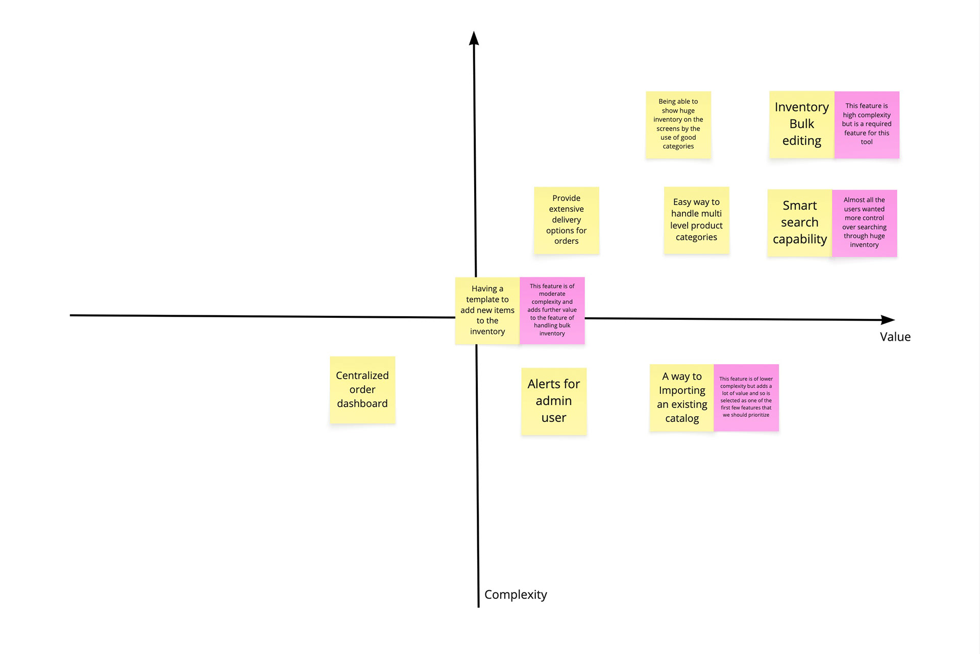
Feature Ideation & Prioritization
Sketches
I sketched a few different versions for a product display pages and product list pages to present to the stakeholder.
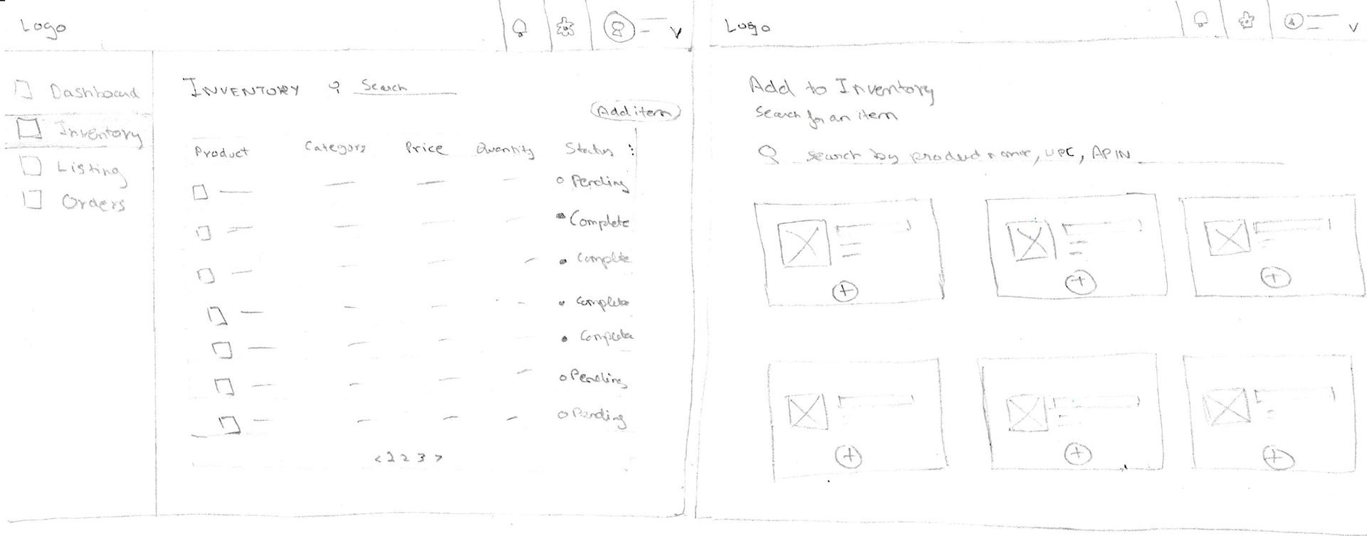
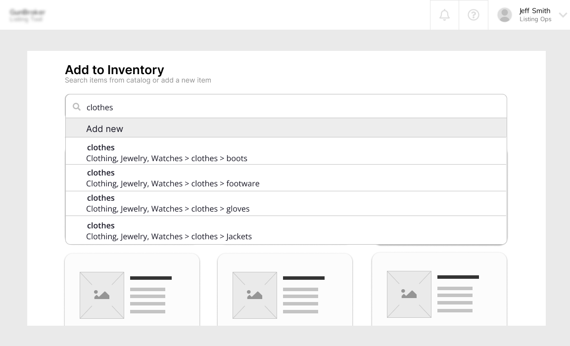
Low Fidelity Wireframes
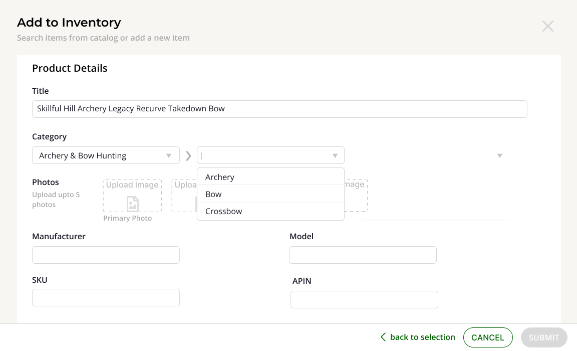
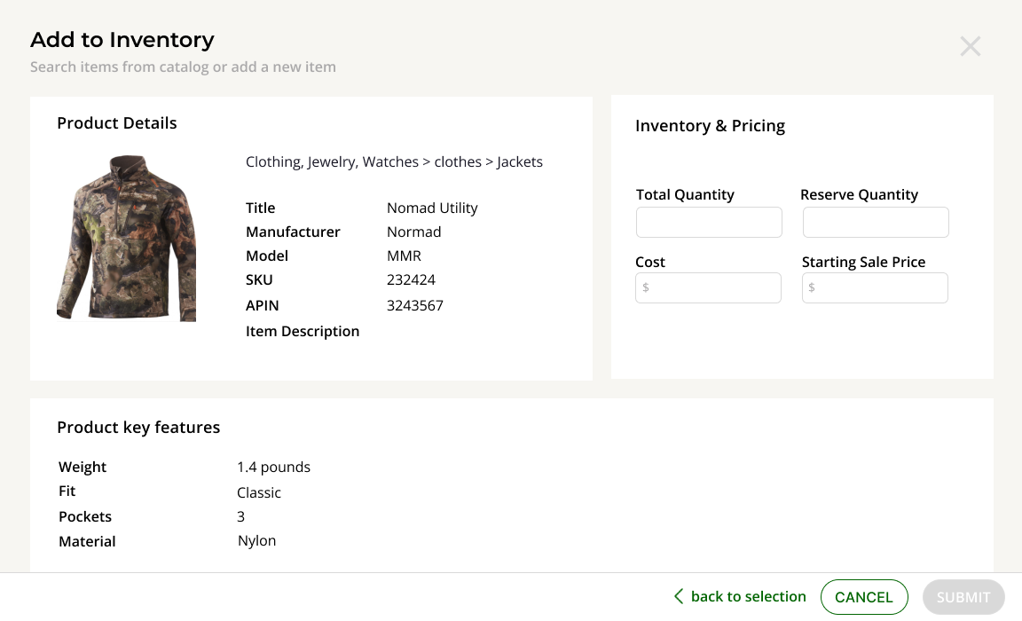
I started with low-fidelity wireframes to explore different layouts and navigation options. These wireframes focused on essential features like product listing, adding inventory and to be able to search product from various categories and sub categories
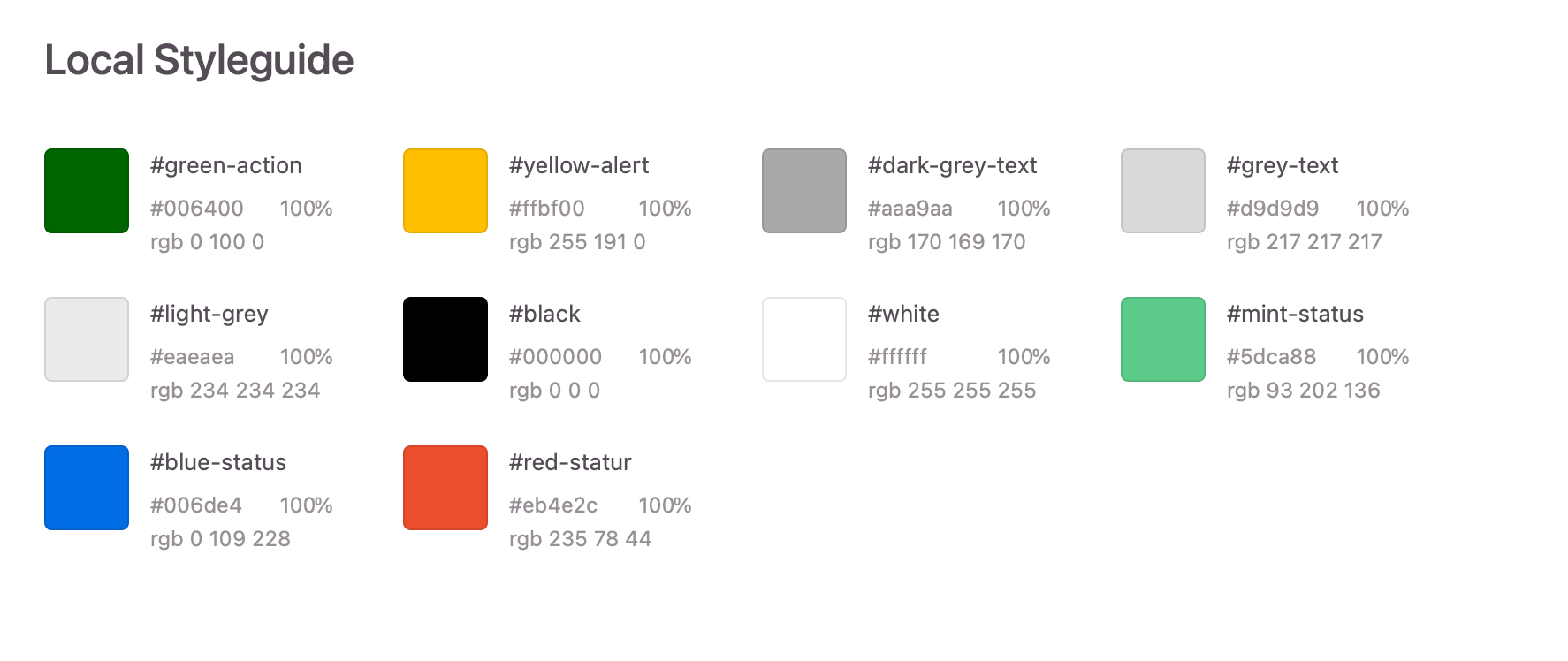
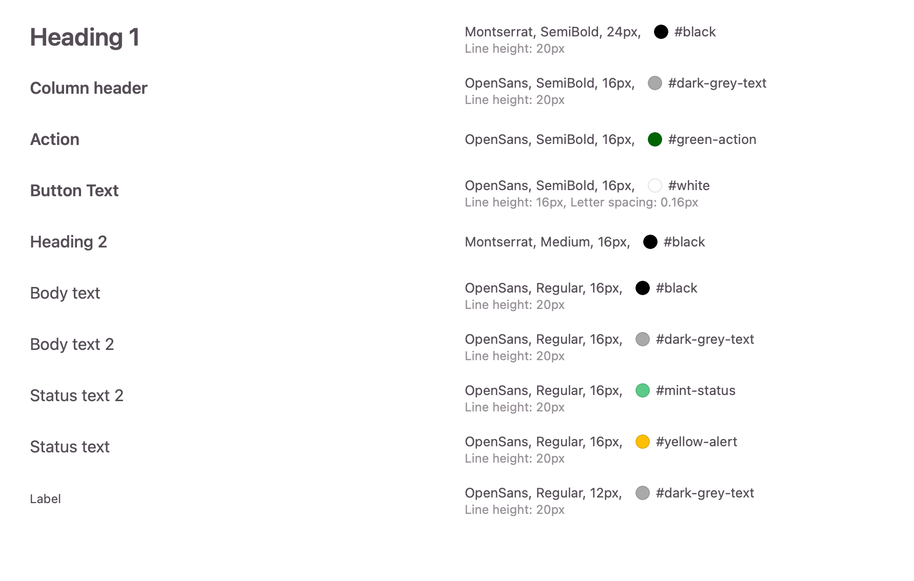
Style guide
This tool was going to be used internally and hence there wasn't much focus on branding.
To keep styling consistent across elements and company's other websites, I created a basic style guide.
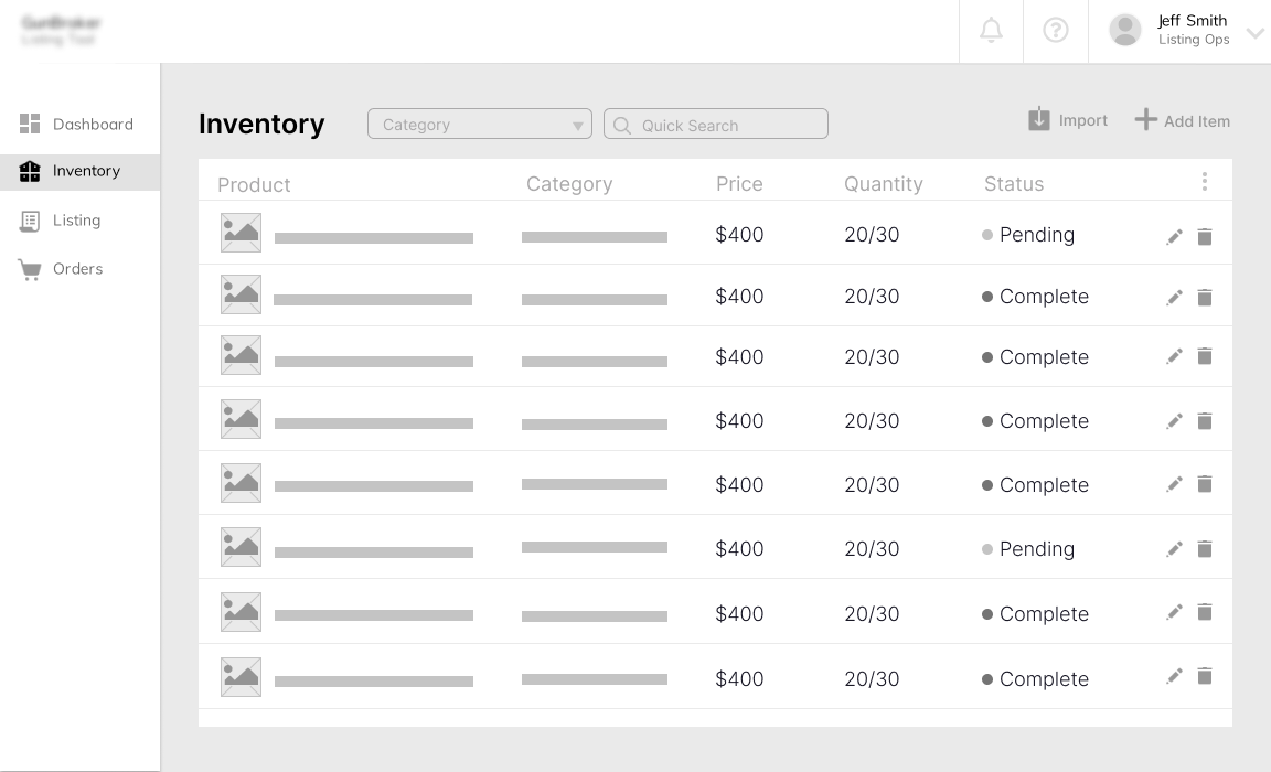
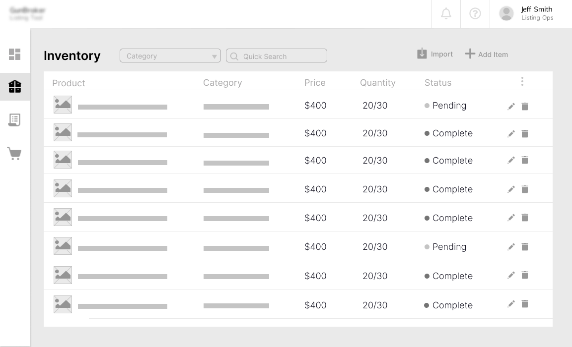
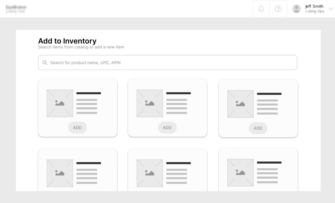
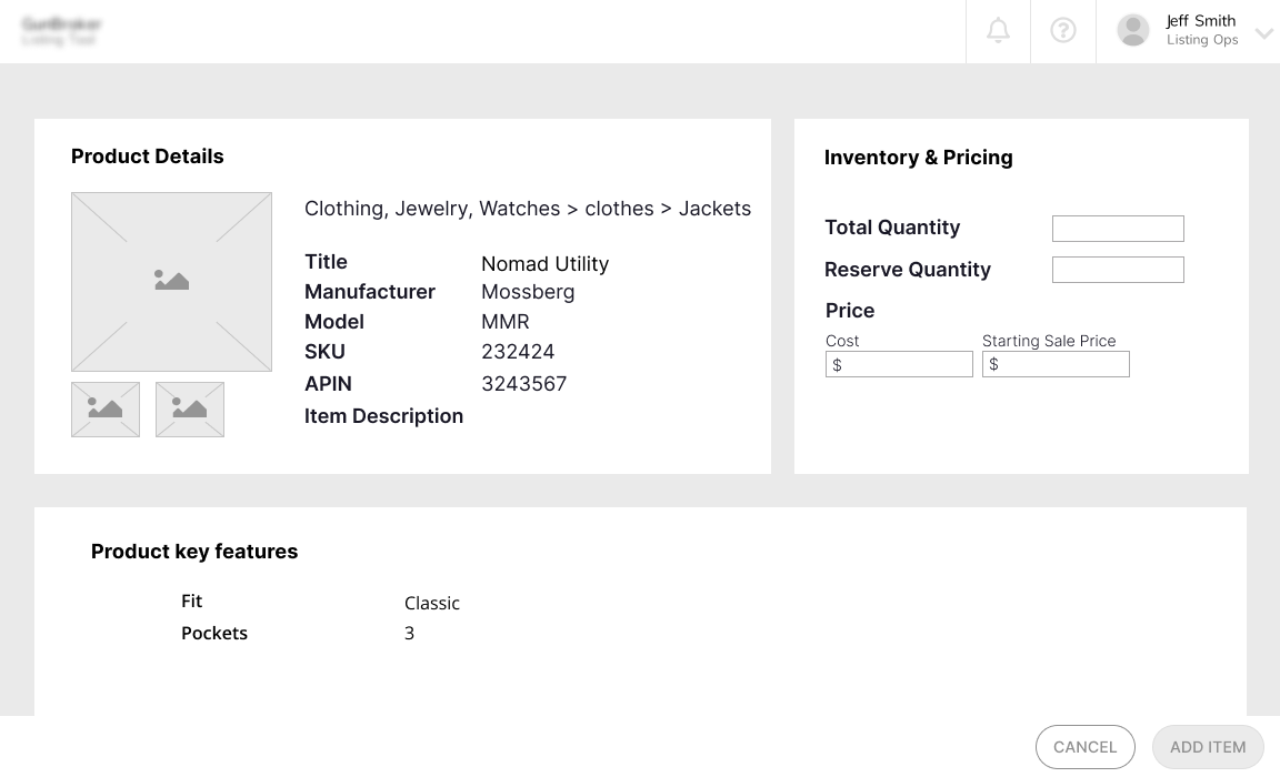
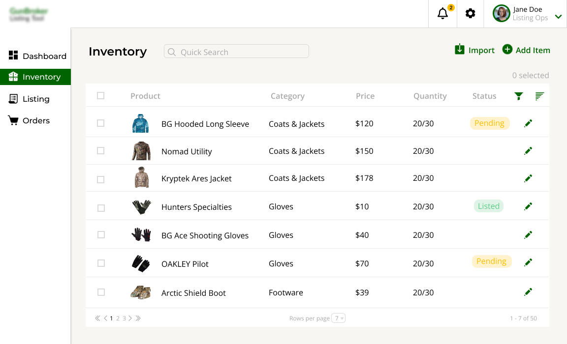
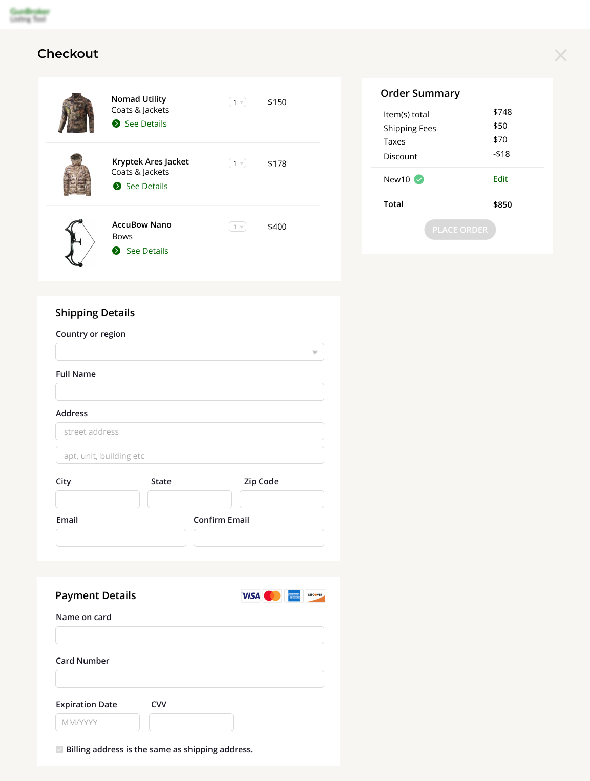
Hight Fidelity Prototype
After a few iterations on the low fidelity designs and approval on the style guide, I created high fidelity designs.
Client was provided with the prototype that depicted the actual UI flow.
Test: Validation, Usability, Feedback
Conducted usability testing and gathered feedback from the user.
I conducted usability tests with users, presenting them with the desktop prototype and a scenario to simulate their basic user tasks. The objective was to identify any barriers that could prevent users to perform their tasks.
Design Iteration & Engineering Hand Off
The designs were reiterated by using the data from feedback and usability testing.
Smooth design handoffs were archived by using the Zeplin tool. This tool was helping in sharing css and reusable UI components.
Key Takeaways & Conclusion
The core challenge was minimizing the learning curve for users transitioning from Excel. I focused on replicating the table-like familiarity in the UI while integrating smart filtering and catalog navigation tools. I prioritized clarity, bulk actions, and easy search. I collaborated with users during testing to validate their comfort level and iterated based on feedback.