Grocery Delivery App Case Study
Bridging the gap between online and in-store experience
My Role
UX Research | UX/UI Design
Tools Used
Figma | Miro | Lookback | Zepline
Challenge & Problem Statement
How might we improve a user’s online grocery shopping experience
The pandemic has changed the way people shop for groceries. A lot more people have started to shop for groceries online. We believe that even after the pandemic, people will take a hybrid approach and shop for groceries in-store and online.
We understand that people who will be ordering groceries online are busy individuals who want to conveniently order groceries when they are at home or at work.
The greatest challenge a user faces in an online grocery delivery app is not having full control over what is delivered to their homes. It is up to the shopper at the store to substitute an item when it's sold out. A lot of times the shopper may not be able to make the right decision for us.
Discovery: User Research & Analysis
Goal: To understand the pandemic’s impact on grocery shopping habits and to explore opportunities to improve the online grocery shopping experience for users.
Process: Conducted screening interviews and selected 5 users for semi-structured video call interviews to gather qualitative data. Further conducted a survey to validate the findings.
Key Findings:
- People have started to cook more food at home
- People have started to believe in online grocery shopping
- 80% of participants were not happy with the substitutions made by the app/shopper
- Participants need better control and live updates on their items being shopped
Design: Concepts & Sketching
With the help of key findings from the user research and techniques like Crazy-8s, layout and detailed sketches, a list of key features were ideated for the product. I then prioritized 3 features by using the value vs complexity quadrant.
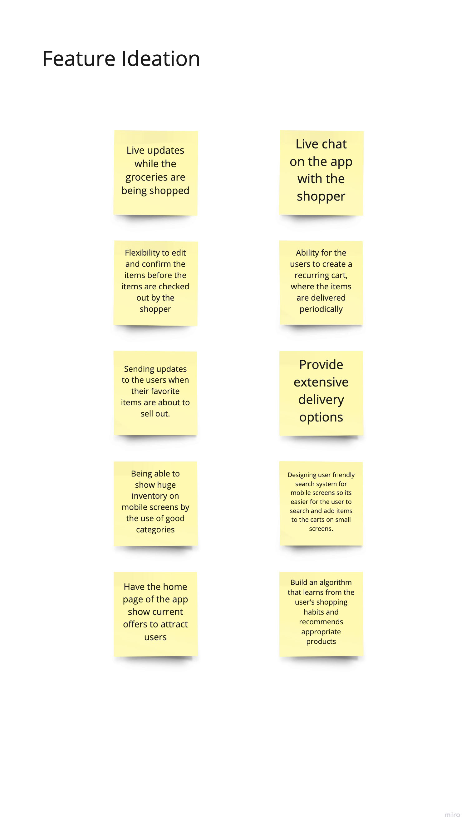
Feature Ideation
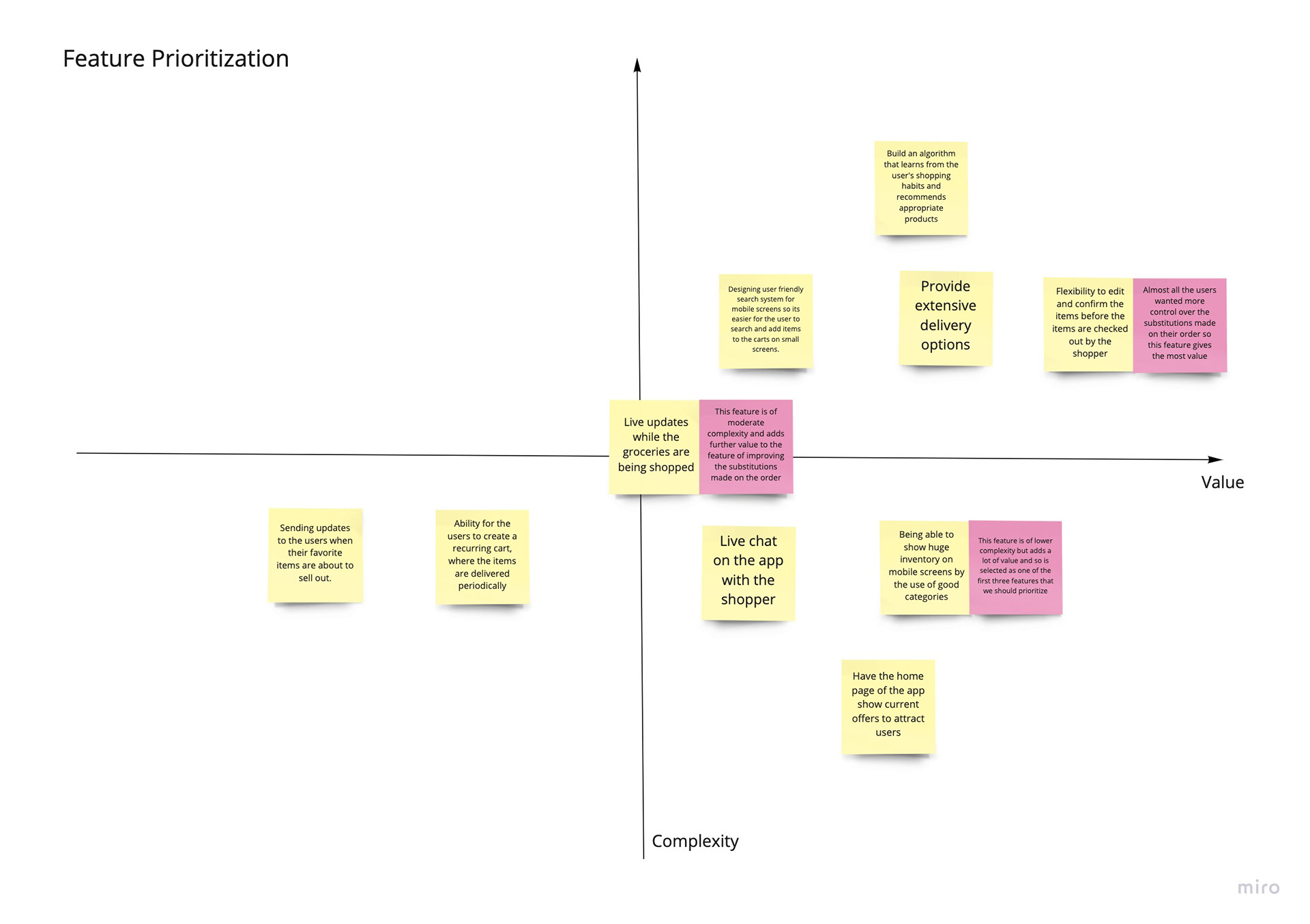
Feature Prioritization
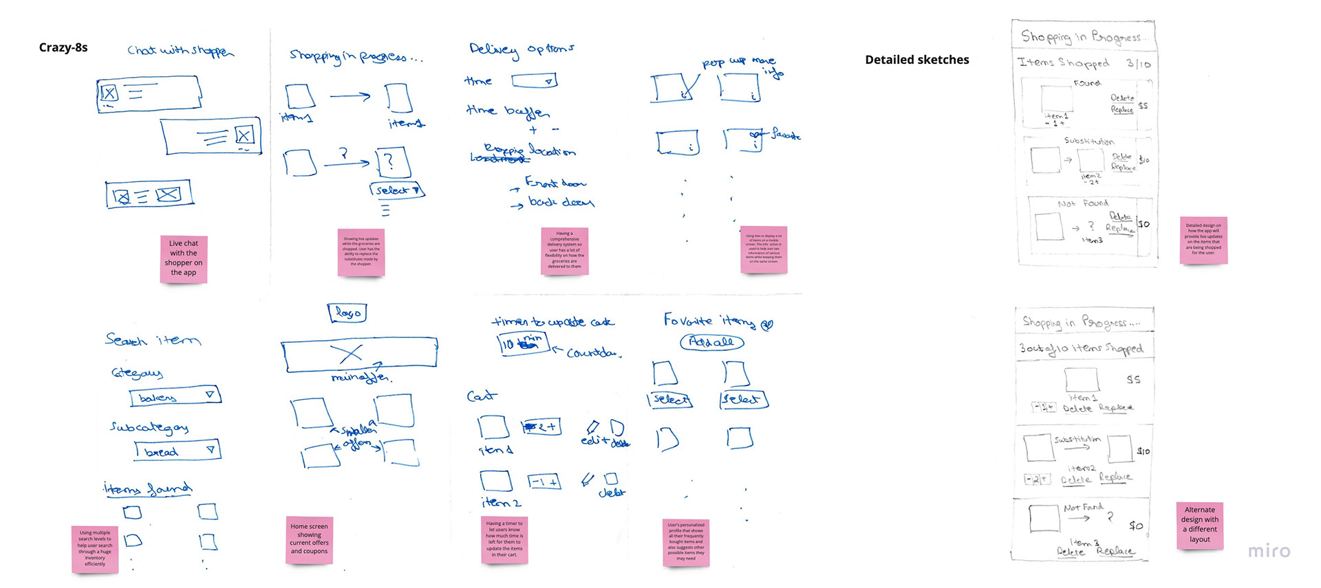
Crazy-8s technique & Sketches
Figma was used to perform low-fidelity rapid prototyping. With the use of usability testing early on in the process of prototyping I was able to iterate my low fidelity designs to a high fidelity prototype.
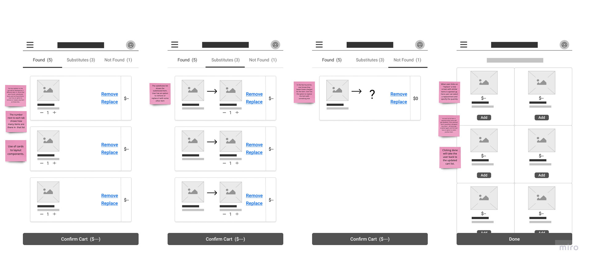
Low Fidelity Designs
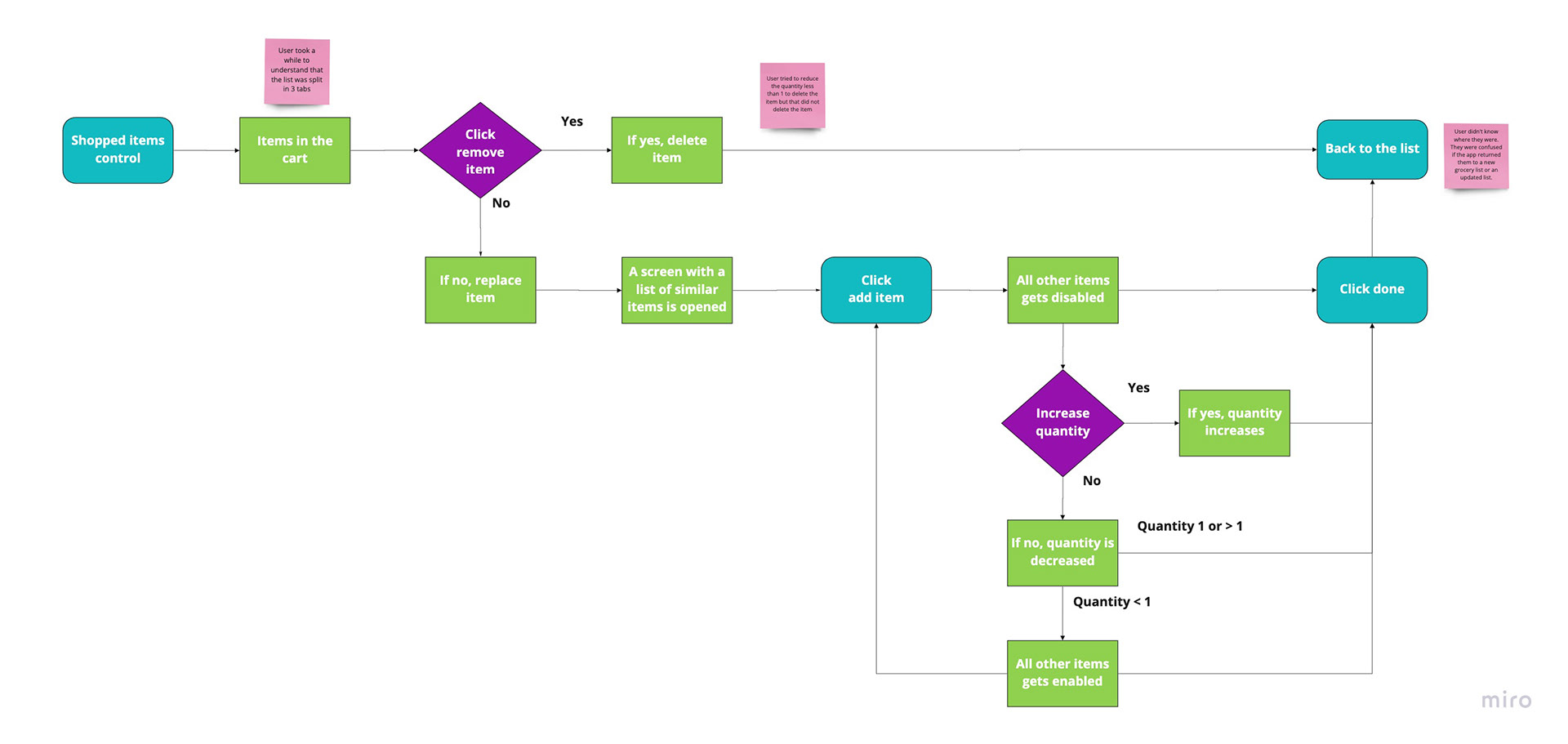
Early User Testing
Develop: Prototyping
To keep styling consistent across elements, a detailed style guide was created
The low fidelity designs were then converted to high fidelity mockups.
Clickable prototypes were also created.
Test: Validation, Usability, Feedback
Conducted usability testing with 10 users to validate the designs. This was done remotely using LookBack.
Key findings: CTAs (call to actions) were not clear on one of the screens, due to which users took a while to find the button to complete the task.
Hypotheses: Improving the design of these buttons will decrease the time on task.
Design: Iteration
Using web content accessibility guidelines - changed the color and font of the designs to improve accessibility.
The final solution was created by improving the accessibility and reiterating the designs by using feedback data.
Solution & Impact Overview
The user research showed a promising future for online grocery shopping. Though the existing grocery shopping apps were providing convenience to the users, it lacked a few benefits that in-store shoppers had. With this solution I was able to improve the user's experience in online grocery shopping.
These added user flows will provide the user more control on what groceries get delivered to their home.

